Marktcheck — Conceptual Cross-Media Redesign
A conceptual redesign of Marktcheck, the SWR consumer magazine.
The project reimagines the show as a unified, responsive identity system that works seamlessly across on-air, online, and print platforms — consistent, flexible, and meaningful.
The project reimagines the show as a unified, responsive identity system that works seamlessly across on-air, online, and print platforms — consistent, flexible, and meaningful.

TYPE
Bachelor’s thesis (Hochschule der Medien, Stuttgart) — 2017
ROLE
Concept, design system, motion, digital templates, research (SWOT & competitor analysis)
FOCUS
Cross-media brand identity · Responsive design system · Strategic brand claim

The Thought Behind the Brand

At the heart of the redesign lies a clear idea —
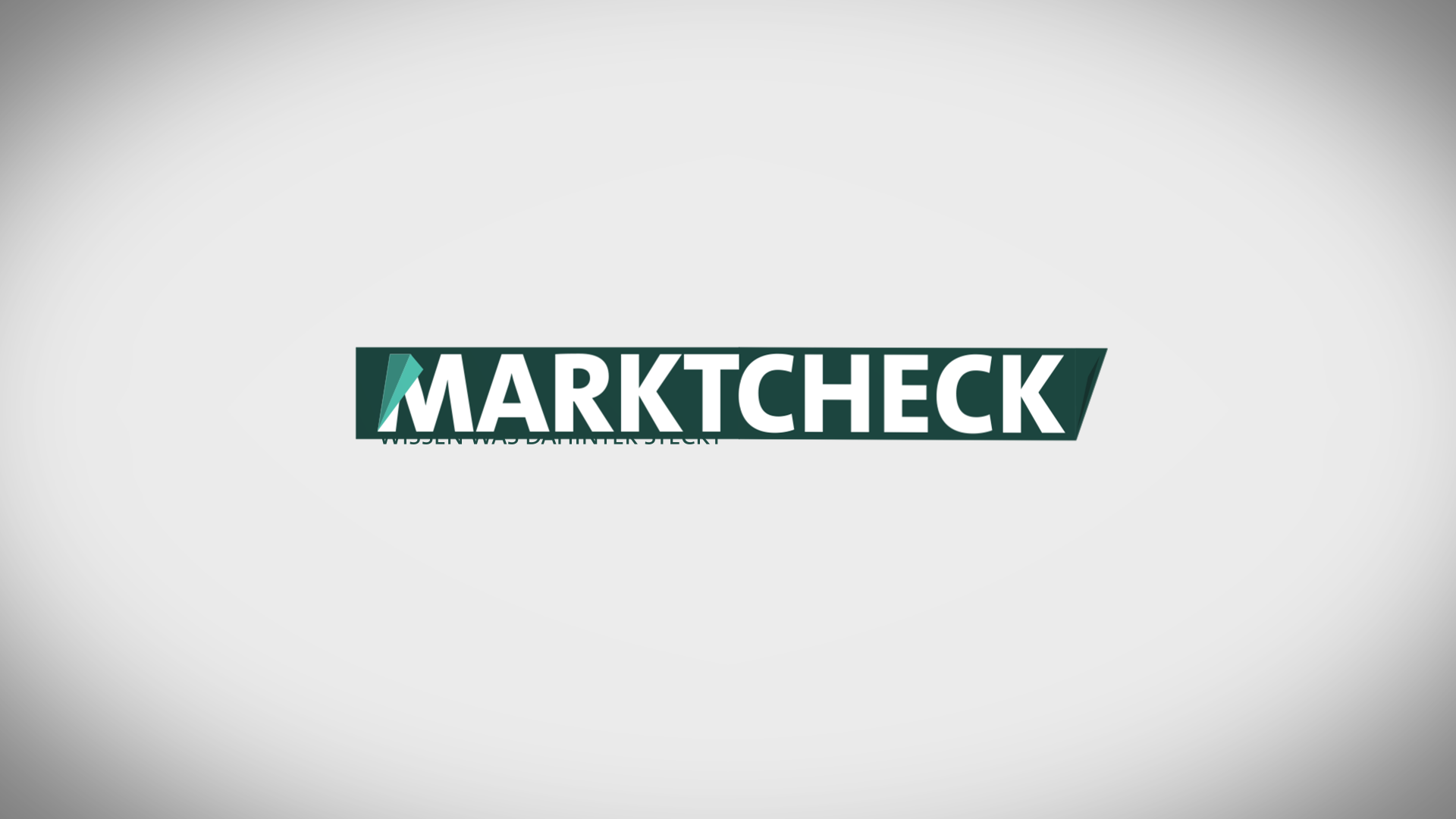
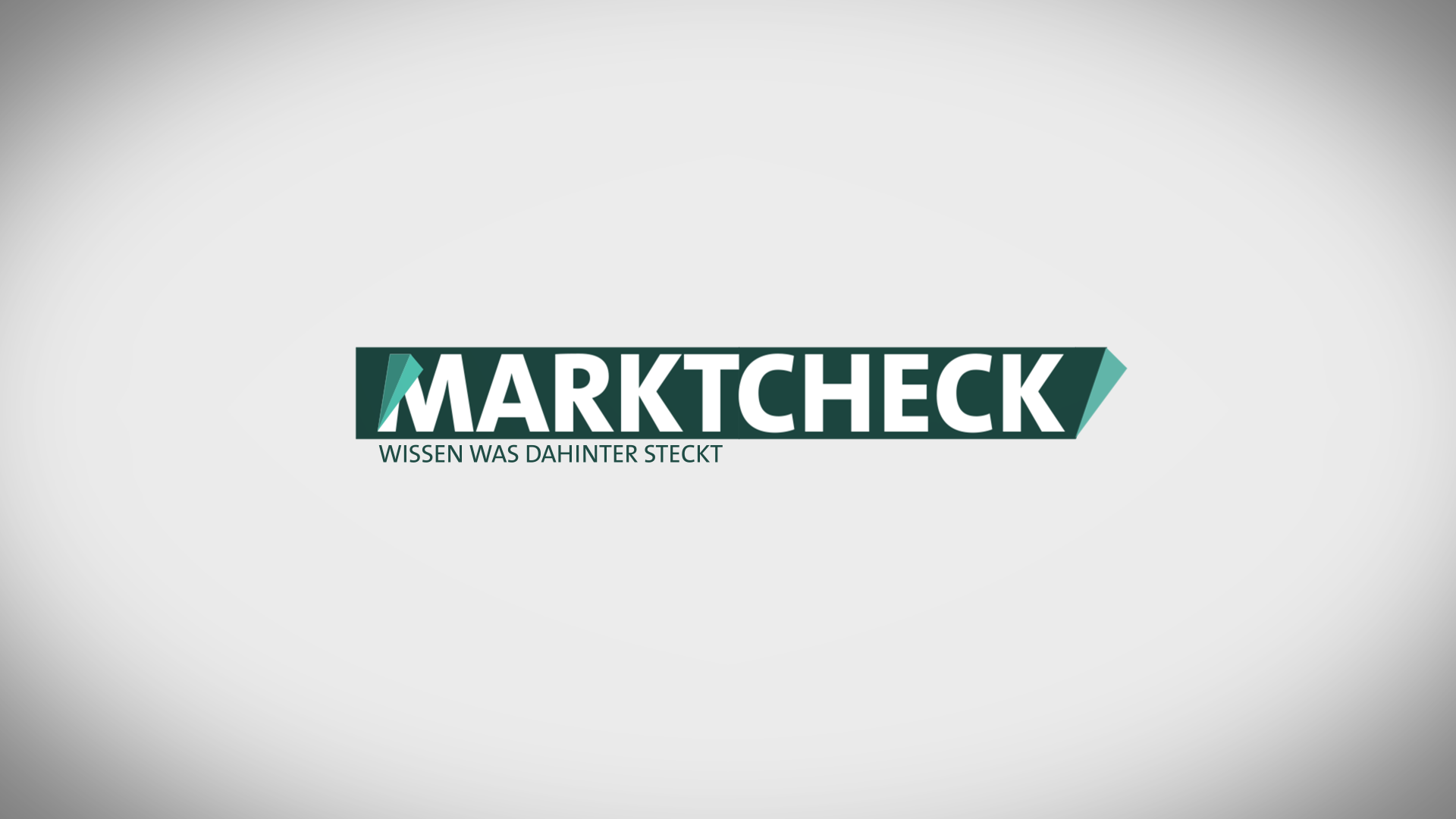
“Wissen, was dahinter steckt”
(“To know what’s behind the visible”)
“Wissen, was dahinter steckt”
(“To know what’s behind the visible”)
Marktcheck is a consumer magazine that analyses and tests brand products independently — uncovering facts, revealing hidden stories, and helping viewers make informed decisions.
The new brand identity translates this journalistic mission into a design language.
The new brand identity translates this journalistic mission into a design language.
The brand claim expresses curiosity and transparency: a commitment to look behind the surface.
Visually, this principle becomes the fold — a subtle design element that reveals what’s beneath, mirroring the show’s investigative nature.
Visually, this principle becomes the fold — a subtle design element that reveals what’s beneath, mirroring the show’s investigative nature.
Challenge
The existing design was fragmented and non-adaptive.
A single, inflexible logo had to represent everything — from television to social media — making consistency impossible. The system lacked hierarchy, symbolism, and usability for daily editorial needs.
A single, inflexible logo had to represent everything — from television to social media — making consistency impossible. The system lacked hierarchy, symbolism, and usability for daily editorial needs.
Objective
Create a unified, flexible brand identity that could adapt across all media, while keeping Marktcheck’s trustworthiness and editorial clarity
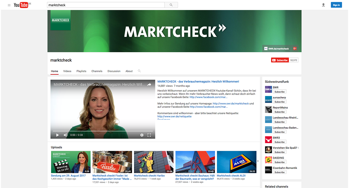
old YouTube page
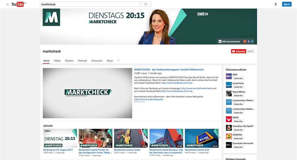
new YouTube page
Approach
Grounded in brand and media research, the redesign builds on insights from a SWOT and competitor analysis.
The goal: to construct a cross-media design system that serves users, viewers, and editors equally — scalable, recognisable, and strategically coherent.
The goal: to construct a cross-media design system that serves users, viewers, and editors equally — scalable, recognisable, and strategically coherent.
Design System
The visual system (the fold) translates the brand’s investigative mindset into a modular, flexible toolkit that works across all formats — from TV to digital to print.
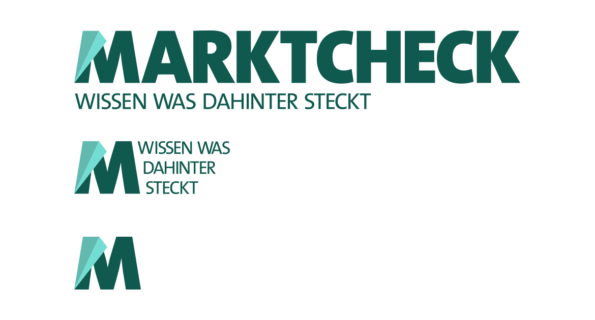
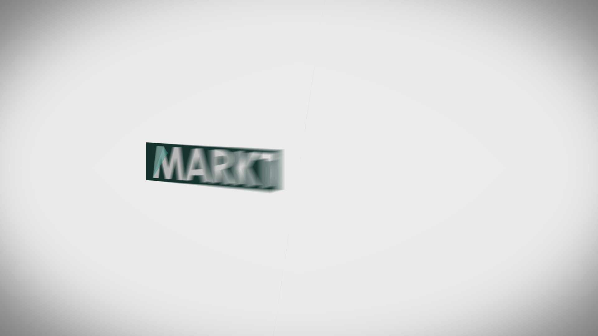
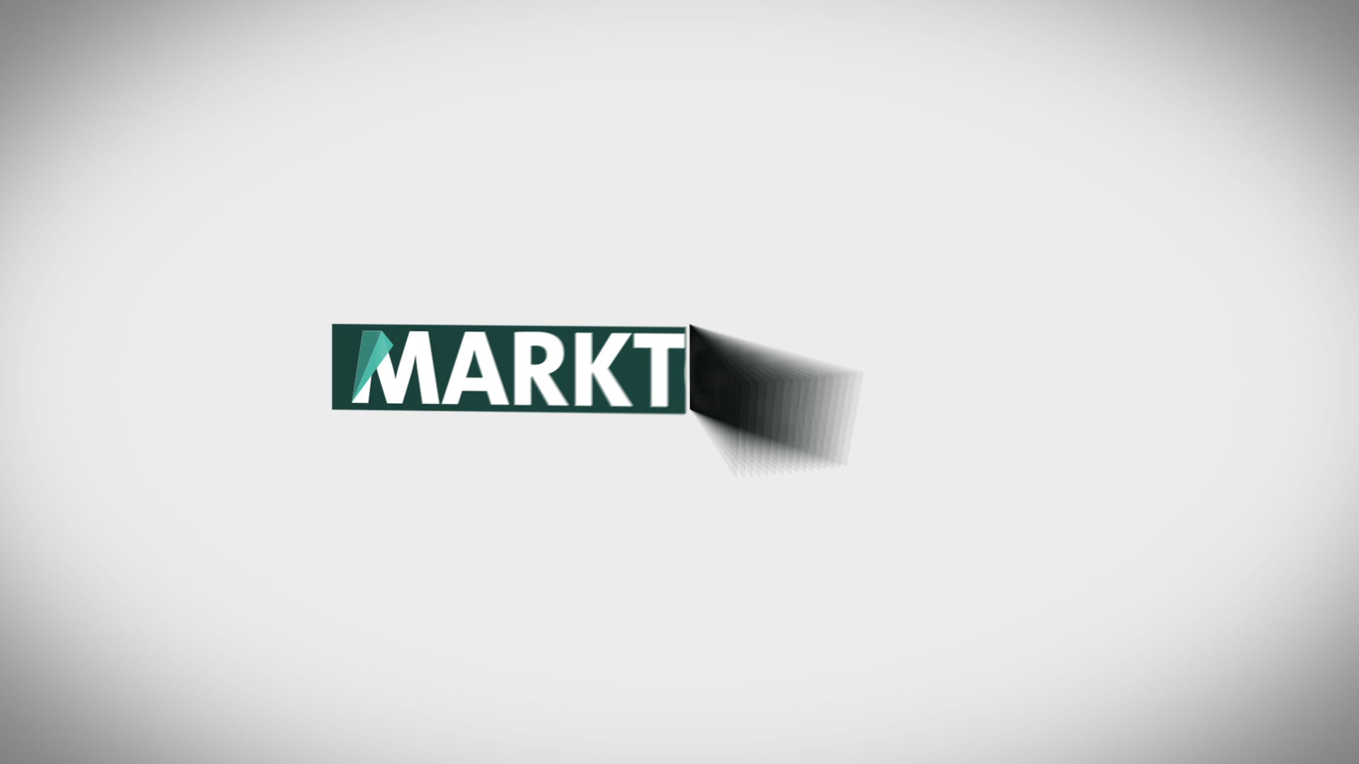
Logo System
A modular logo family adapts to every context: from detailed primary marks for broadcast to simplified icons for social. Each variation maintains recognition through shared geometry and fold logic.
The Fold — Signature Element
The fold acts as both design motif and storytelling device.
It connects all media touch points — from lower-thirds and banners to social cards — and expresses the show’s claim physically: what’s behind becomes visible.
It connects all media touch points — from lower-thirds and banners to social cards — and expresses the show’s claim physically: what’s behind becomes visible.

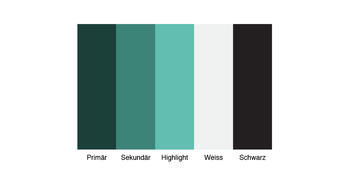
Color & Typography
A focused palette of petrol, white, and a single highlight accent ensures clarity and consistency.
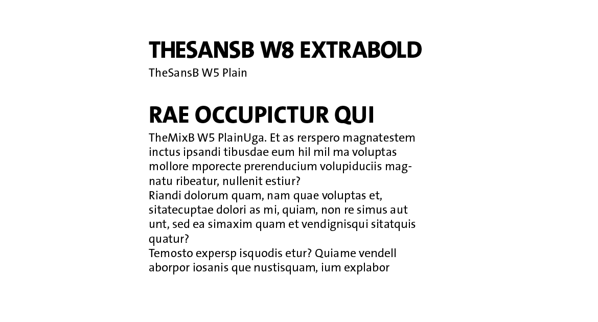
Typography — TheSans — carries the SWR DNA while keeping information clean and accessible across screens.
Typography — TheSans — carries the SWR DNA while keeping information clean and accessible across screens.
Applications
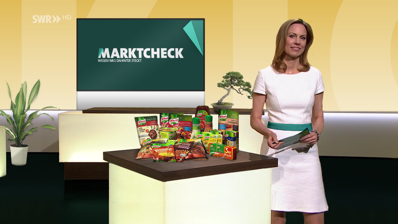
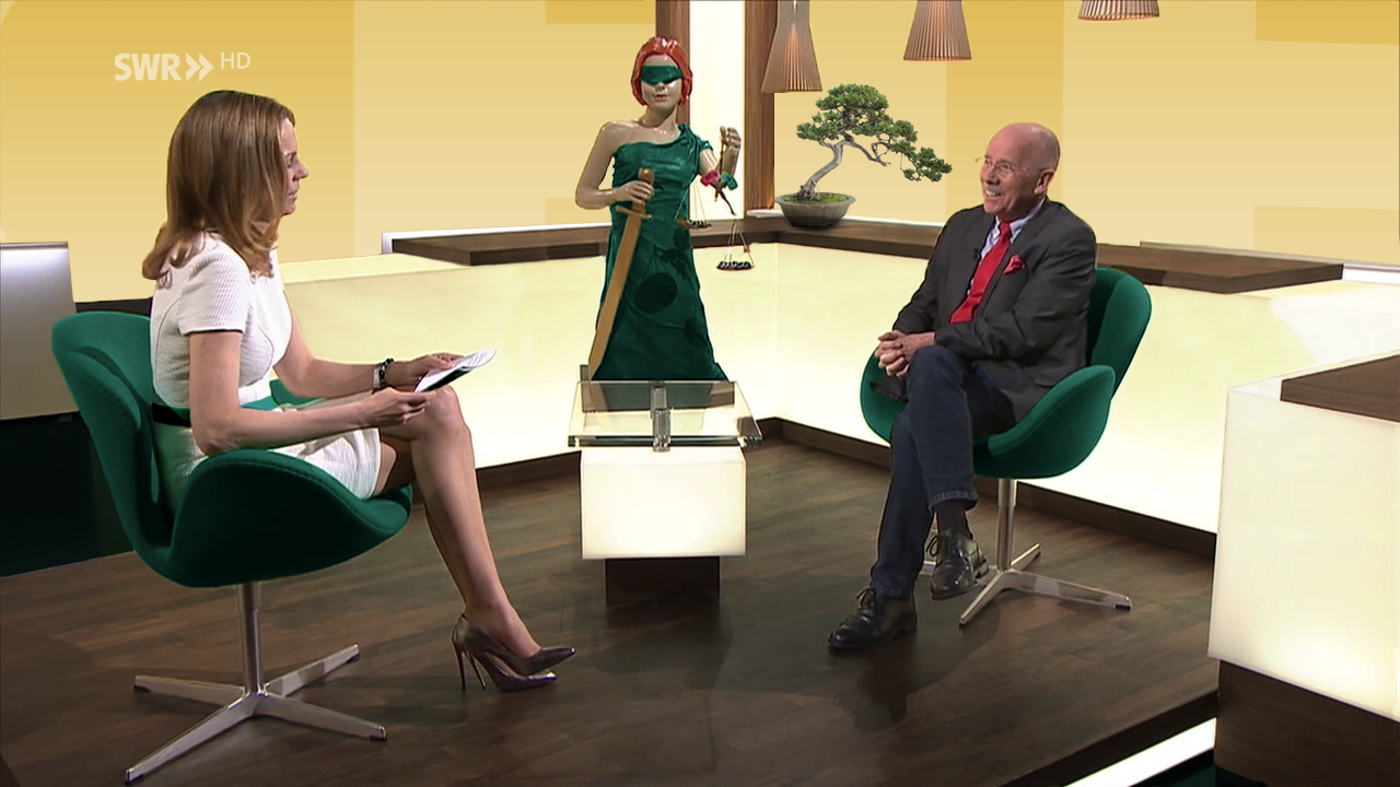
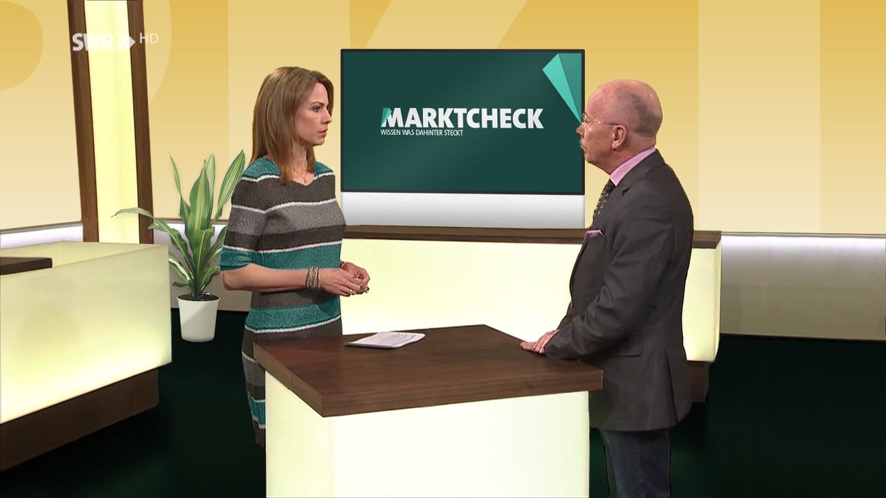
On-Air
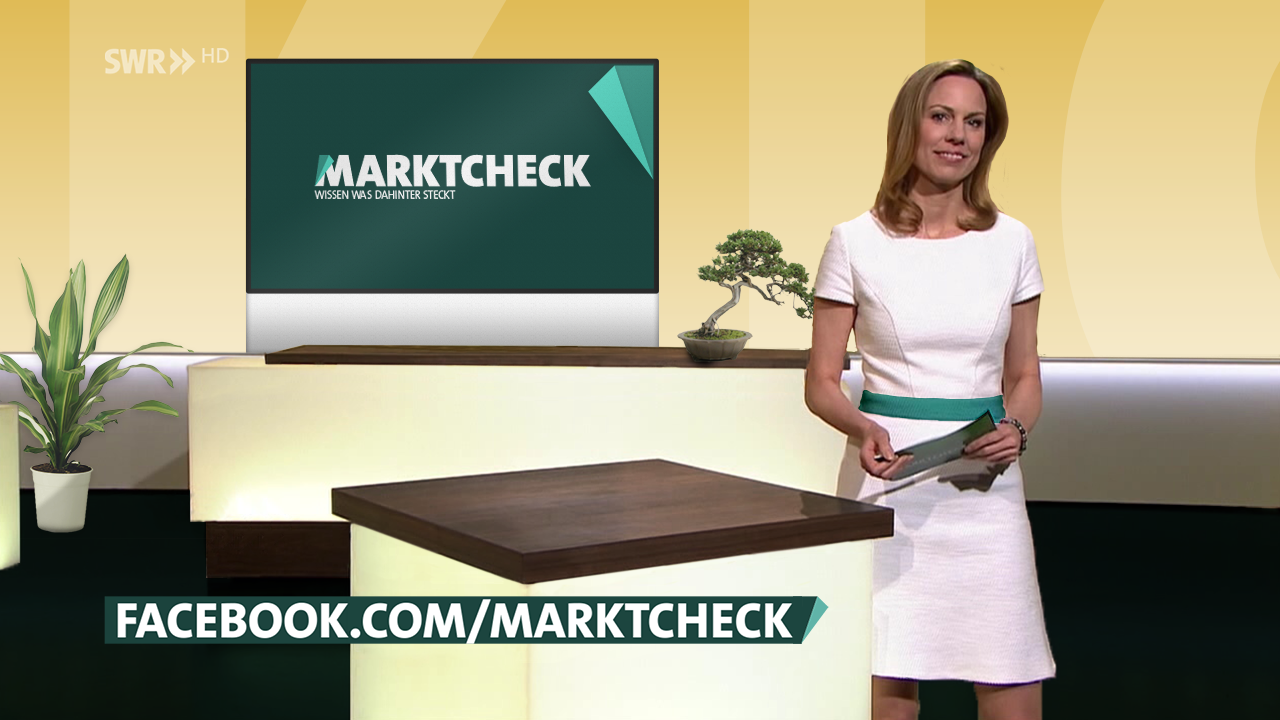
Intro: Fold motion introduces the claim — revealing facts behind imagery.
Studio package: Balanced visuals support the host and content.
Lower-thirds: Fold opens to display context — a small motion metaphor for investigation.
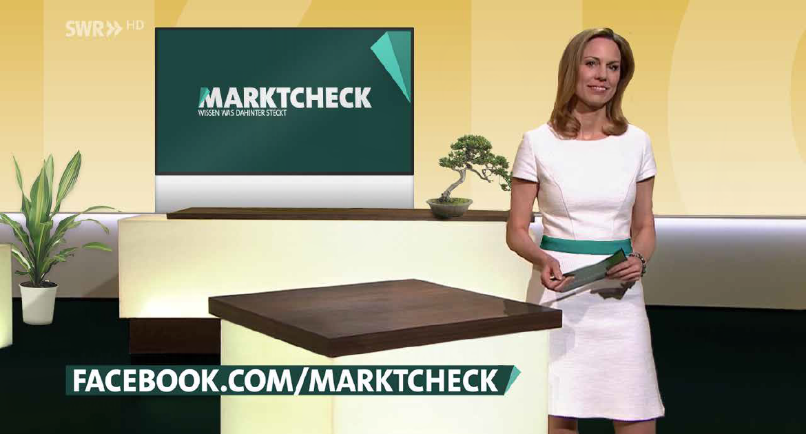
Online
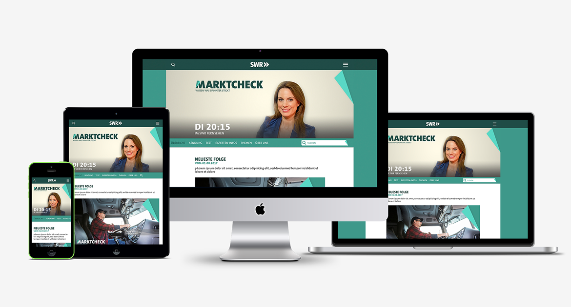
Responsive layouts integrate the fold as a content highlight.
The brand system adapts effortlessly from widescreen to mobile, maintaining recognition and clarity.
The brand system adapts effortlessly from widescreen to mobile, maintaining recognition and clarity.
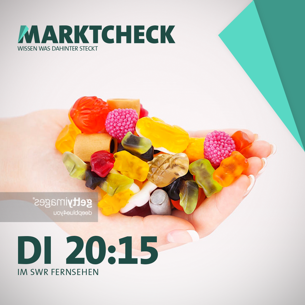
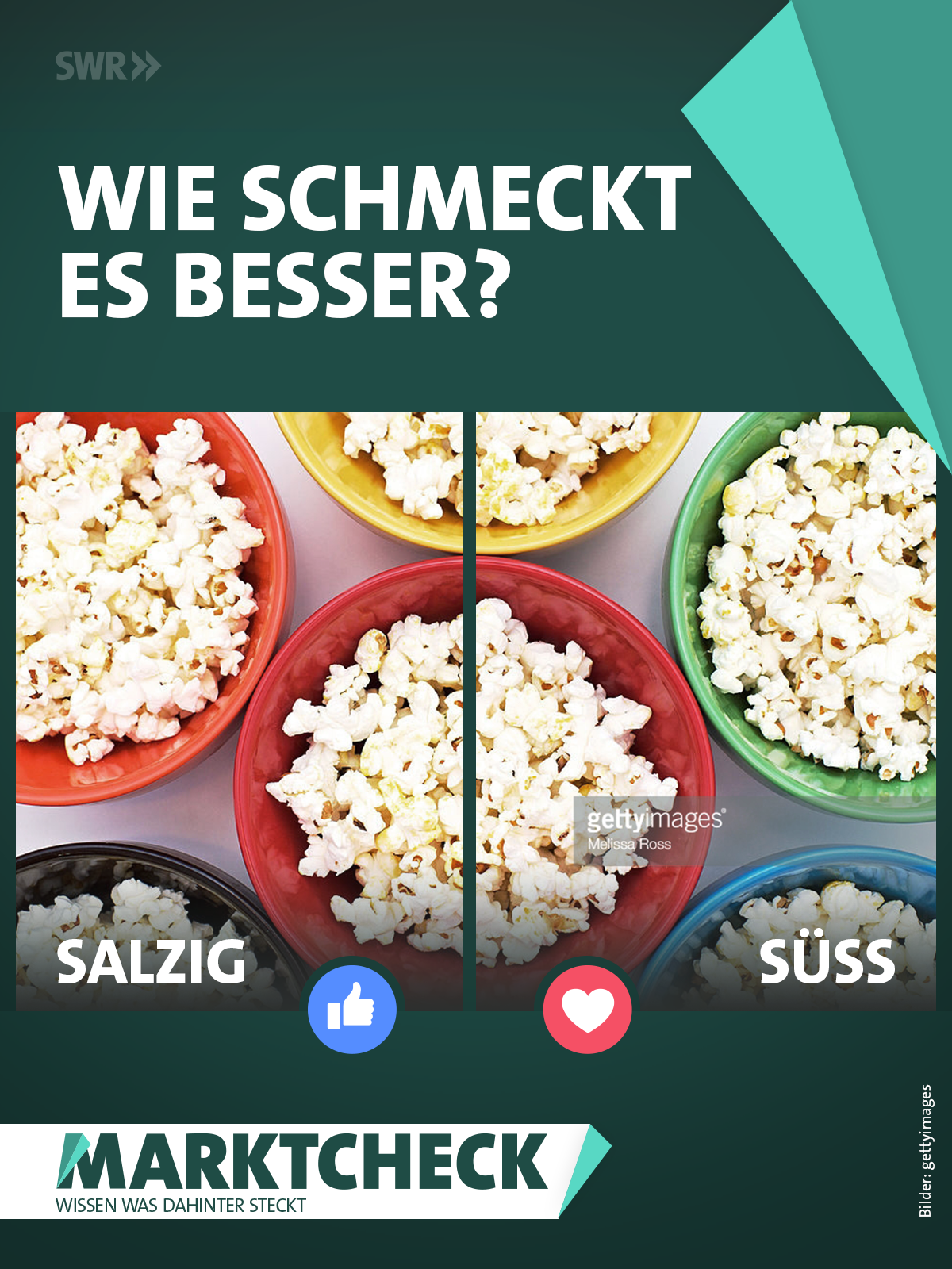
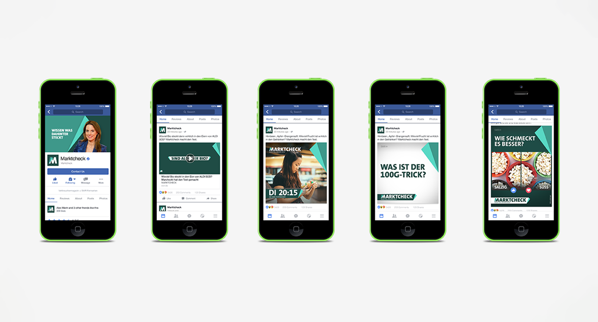
Social Media
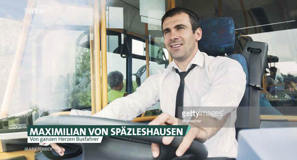
Avatars, covers, and story templates apply the fold and claim consistently, giving every post a Marktcheck fingerprint.
Designed for editors to use easily — without losing control of the brand language.
Designed for editors to use easily — without losing control of the brand language.


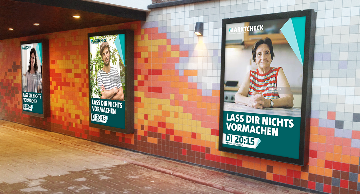
Print
Simple grids, fold accents, and a calm color ratio create clarity and trust across posters and print media.
Outcome
A cohesive cross-media identity system that connects message and form:
what’s behind the visible — both literally and conceptually — becomes part of the design language.
This system bridges disciplines and ensures consistent storytelling from broadcast to digital.
what’s behind the visible — both literally and conceptually — becomes part of the design language.
This system bridges disciplines and ensures consistent storytelling from broadcast to digital.
Deliverables
● Brand claim + strategy
● Logo family and design guidelines
● On-air graphics system
● Web and social templates
● Print campaign
Reflection
The project demonstrates how a brand’s idea can shape every visual decision.
A clear concept — “to know what’s behind the visible” — guided every element, turning Marktcheck into not just a visual redesign, but a conceptual brand identity.
A clear concept — “to know what’s behind the visible” — guided every element, turning Marktcheck into not just a visual redesign, but a conceptual brand identity.